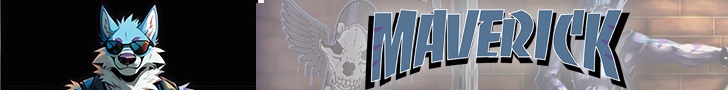

Yo, what up, everybody?! It's Maverick Lobo, here to drop some truth bombs about the inner workings of this whole Wolfman shebang! This week, we're diving headfirst into the gnarly process of designing the Maverick Lobo logo. This ain't no ordinary story; it's got more twists and turns than a sick skatepark! So, ditch the small talk, grab your board, and let's shred!
Okay, real talk. Graphic design? Way freakin' harder than drawing! Before I was tearing it up at MCAD, I was just another punk kid stuck in Central Campus in Des Moines. They had this class called Graphic Communications, but let's be real, it was a design class.
Shout out to Tim Rice and Jeffrey Boch – those dudes were legends! But back then, I was a total bonehead, thinking I knew everything. Stubborn as a pit bull, too! All I wanted to do was draw manga and mess with Photoshop (CS3, represent!). I thought design was for squares. But man, that class totally ripped me a new one.
It taught me so much! Stuff I still use every day. It became, like, a core memory from high school. Seriously, I ditched other classes just to hang out in that design room! It was that awesome!
For three years straight, I was all in on that design class (From Sophomore to Senior year). I learned the basics of design, the software... the whole shebang! It seriously helped me out at MCAD and beyond.
Okay, so now we're flashing forward to today. After countless logo projects and clothes I've designed, I had to face the ultimate test: designing a logo for my dream as Maverick Lobo. Why is it such a big deal? Listen up, a logo is one of the most important tools out there for a business, a platform, an influencer, whatever! It's what makes you instantly recognizable – or totally forgettable. I've even scored art gigs just because of my logos in the past! So with the Maverick Lobo logo, I wanted it to be totally rad and one of a kind. I had to go digging for some serious inspiration.
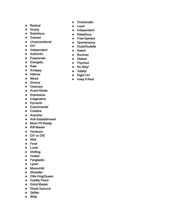
The first thing we learned back in my graphic communications class is that you always have to list everything you want to communicate through the design, whether it be a logo, a poster, or whatever. If a picture is worth a thousand words, then a thousand words are worth a picture.
If a design is solid, it should get your point across loud and clear. So, with that in mind, I wrote a list of everything Maverick needed to represent.
Once you have a general idea of the message you're trying to convey using selected keywords, it's time to do research.
Once you figure out your message through all those keywords, it's time to go digging for inspiration. Find other logos and designs that are similar to the ideas on your list. Don't get me wrong, you're not gonna rip off someone else's design; that's a total cop-out. The point is to see how others have solved similar problems.
Honestly, this is the trickiest part. You can find tons of designs that work, but none of them hit the mark. For me, a logo has to be clever, and it has to be beautiful. Anyone can slap a circle on an image and call it a logo, but it takes a real designer to create something that's totally unique and delivers the message loud and clear. The best logos are often the simplest!
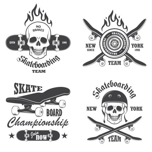
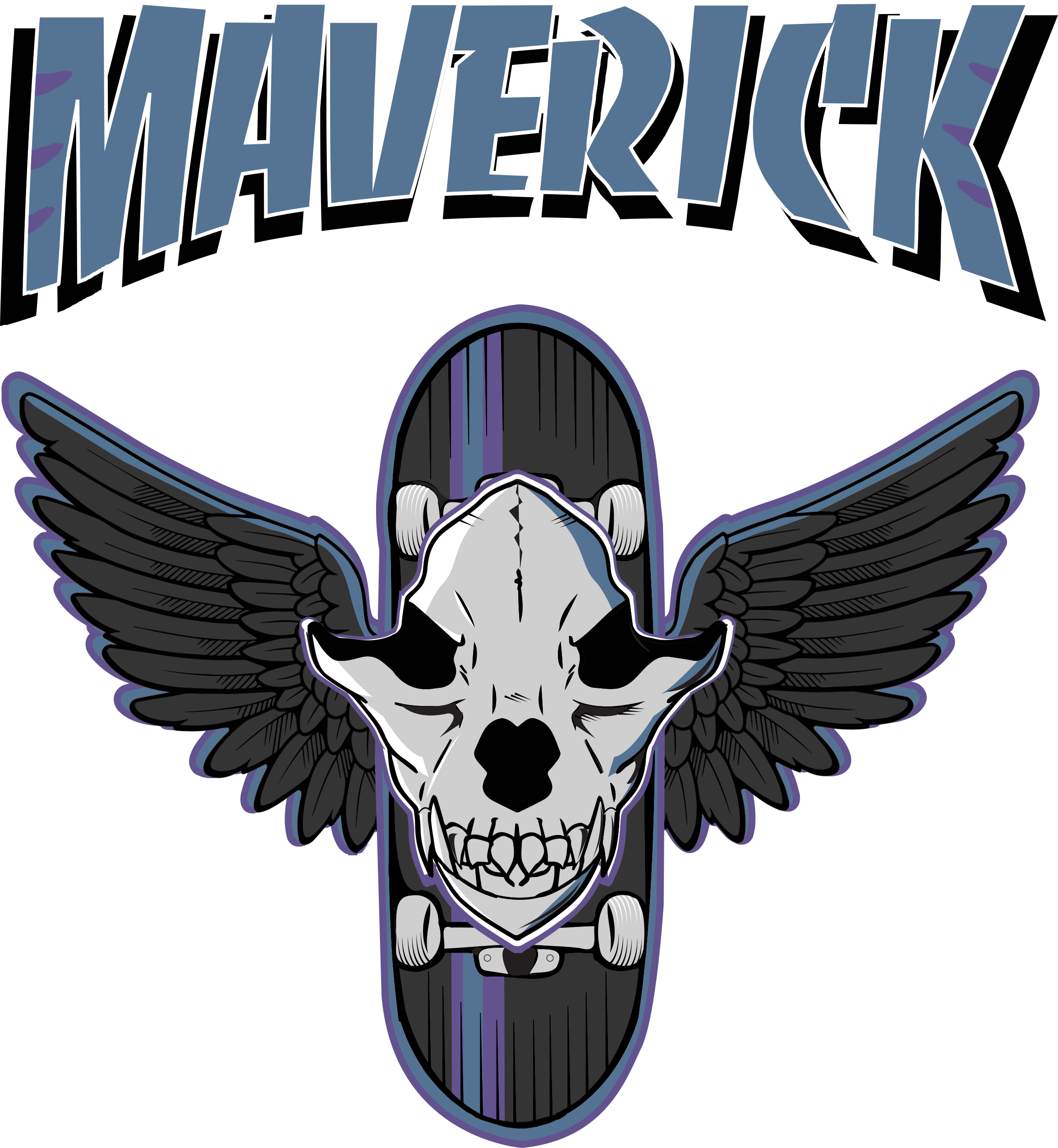
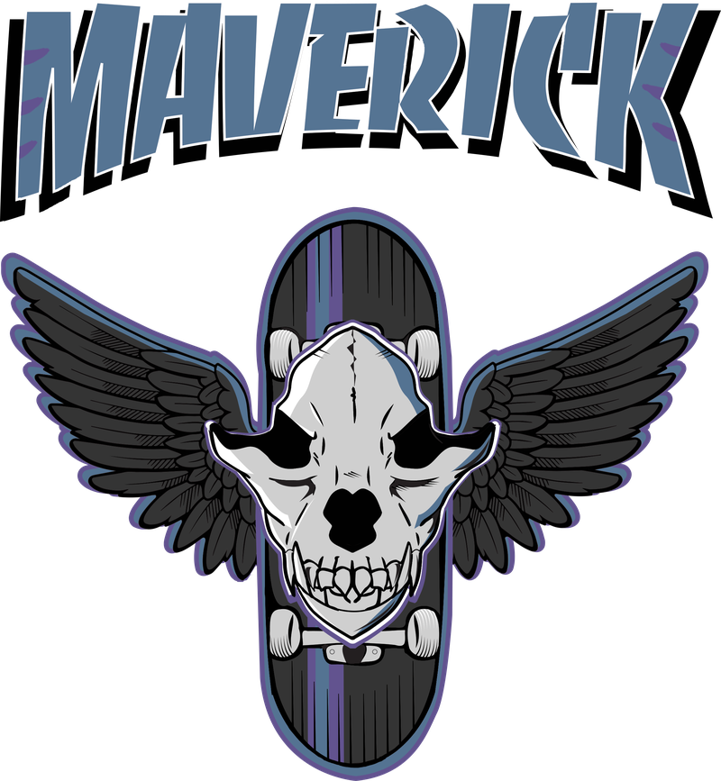
Since Maverick's a skateboarding, punk rock werewolf, I started by checking out skate logos. I was really digging the vibe of Tony Hawk's American Wasteland at the time, so I was looking for something retro, like from the late 70s. Guess what? A ton of skate logos use skulls and bones, probably because skating's a total bone-breaker!
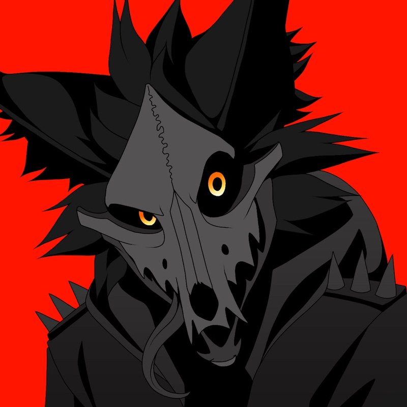
Using the skull idea, I had to be careful because Maverick isn't just about skateboarding, so I needed something that said more. I was really inspired by WingedWolf94, a super-talented animator. I'm a huge fan of their character, Cadaver, and how they use the skull as a theme.
I gotta drop this in, too. I'm a massive pro wrestling fan, especially WWE. The Judgment Day faction (Rhea Ripley, Damien Priest, Dominik Mysterio, Finn Balor, and later JD Vance) was at its peak at the time. Seeing their entrance live blew my mind! It was the coolest thing ever!
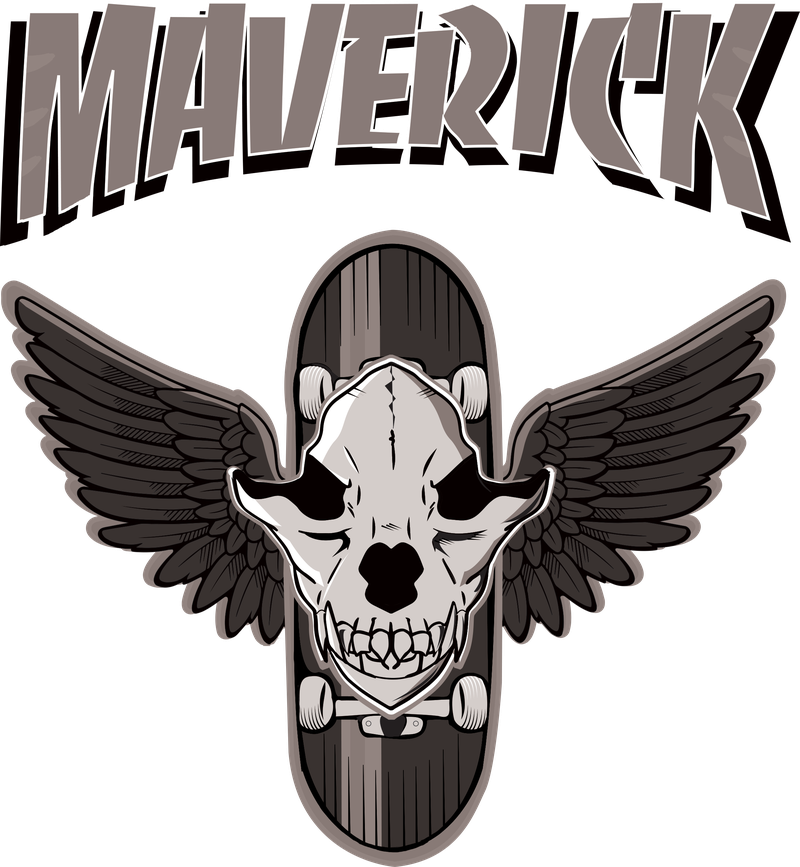
So, after grabbing all the inspiration and references I could, I started piecing everything together to create a cohesive and good-looking design that makes sense. That's how the skateboard skull and The Judgment Day became the Maverick logo, which I think fits Maverick perfectly.
Let's talk about fonts. This is where things get tricky. It's a huge industry for a reason! The font can totally make or break a design. It can change the whole vibe, even with the same words.
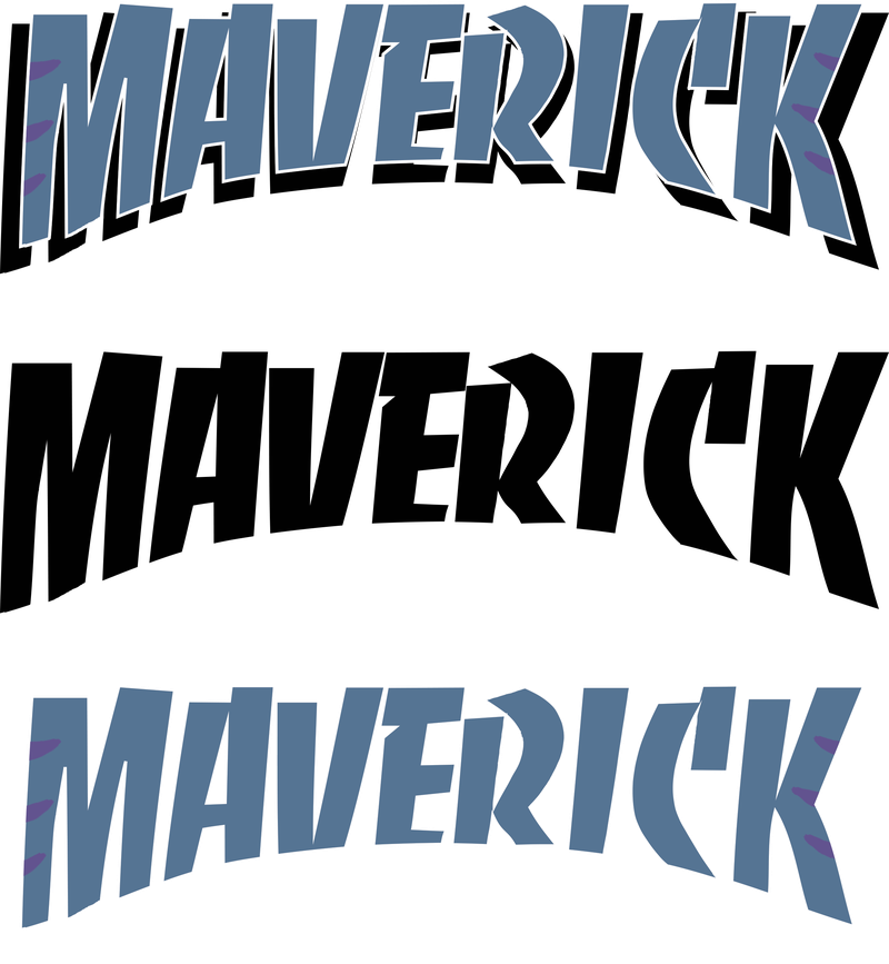
With the Maverick logo, I wanted to do something similar to what I did with the King the Creator logo back in 2019. I really liked the Red Five font because it looked professional and was easy to read. It was fun without being cheesy. I wanted something that shouted that Maverick was a star, like you were seeing his name in lights at a big city concert, without using those typical showbiz fonts, because that would ruin the skater vibe.
Usually, you'd want to do a bunch of thumbnail sketches of different logo ideas to make things easier. I think I lost my sketch sheet, but whatever! Pro graphic designers can easily sketch up to 50 different ideas for a single logo.
The rule of thumb is this: If your logo looks good in black and white, it'll look even better in color, as long as you don't go too crazy. This is where color theory comes in. You should only use 3 to 4 colors (black and white don't count). I could go on and on about how different colors send different messages, but then this would turn into a design lecture. The bottom line is, I needed a logo that fit Maverick the character. Using his fur colors was the obvious choice since he's a colorful werewolf!
Once you've got the basic logo design down, it's time to mess with the colors. You gotta find the combos that scream the message you're trying to send, which for me, meant finding whatever looked the coolest and made sense for the character.
When it comes to color, it's always better to get a second opinion. I could be totally wrong, and what I think is awesome might actually be garbage. So, I sent out a design sheet to all my friends and asked for their thoughts. I kept track of what was working and what wasn't.
Maverick Logo Design Sheet: MavlogoPossibilities
In the end, I nailed it! I finally came up with a design that looked sick, screamed "Maverick," and was totally unique. Since then, I've slapped that logo on everything! It's on the back of my jackets when I'm dancing. It's my art signature. It's everywhere!
So, thanks to the lessons I learned back in that high school design class, I can now crank out designs that actually say something and connect with people. I'm stoked with how the logo turned out, and I'm gonna keep using it as I chase my dreams with Maverick!
Thanks for reading! Be sure to check out the Patreon and Newsletter for more content!